CSS Flex Boxing Guide

Are you confused about CSS flexbox? are you still afraid of layouts?
then here I Nishant a cool developer like you all, present you a new blog to help you in your confusion.
so What is CSS Flexbox?
CSS flexbox is a one-dimensional layout pattern that makes it easy to design flexible and effective layouts. The use of flexbox ensures that elements are properly placed and are predictable. Flex items are positioned inside a flex container along a flex line. By default, there is only one flex line per flex container.


A question must be coming to your mind, Why FlexBox?
- Automatically scale elements (alter height or width) so that they fill the available space.
- Automatically shrink or grow elements to make them fit into the container and prevent overflow.
- Change the order of the items.
- Solve the problem of horizontal and vertical centering.
- Create columns of the same height.
- Create a footer sticking to the bottom of the page.
- Design navigation panels.
Ordering & Orientation-
The contents of a flex container can be laid out in any direction and any order
flex-direction :
Row-

row-reverse-

Column-

column-reverse -
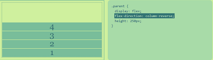
The flex-direction property specifies how flex items are placed in the flex container, by setting the direction of the flex container’s main axis. This determines the direction in which flex items are laid out.
Flex-wrap -
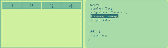
nowrap -
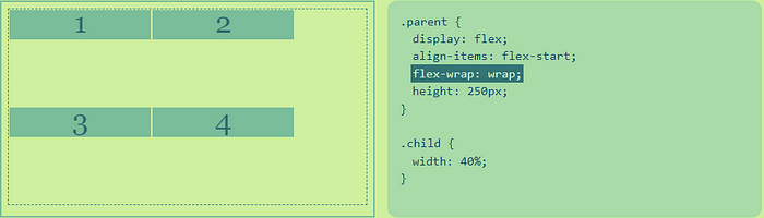
wrap -
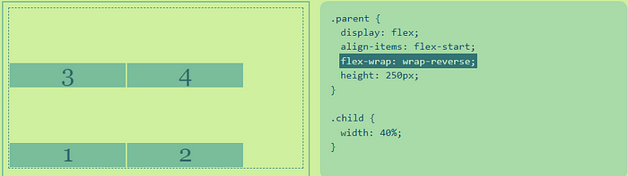
wrap-reverse -
Alignment -
After a flex container’s contents have finished their flexing and the dimensions of all flex items are finalized, they can then be aligned within the flex container.
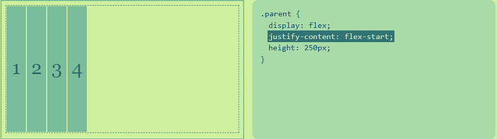
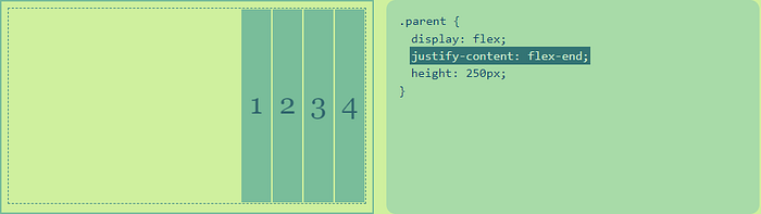
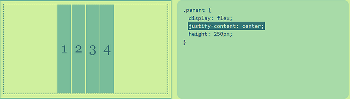
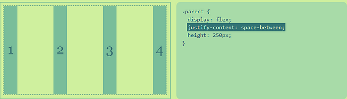
justify-content -
flex-start -
flex-end -
center -
space-between -
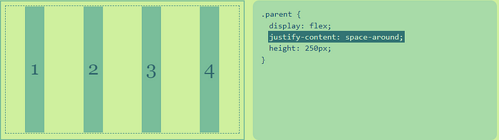
space-around -
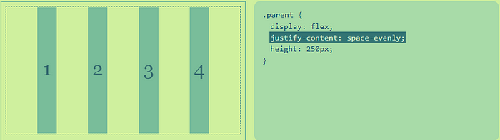
space-evenly -
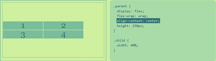
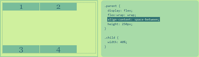
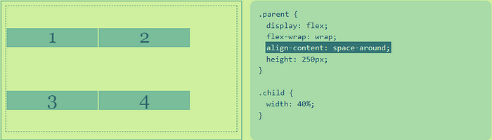
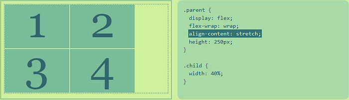
align-content -
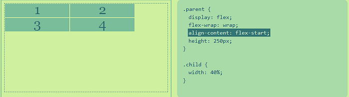
flex-start -
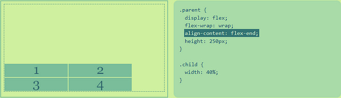
flex-end -
center -
space-between -
space-around -
stretch -
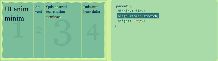
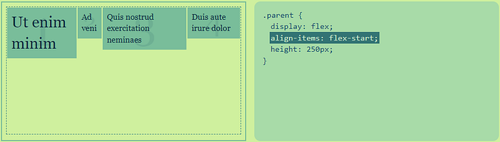
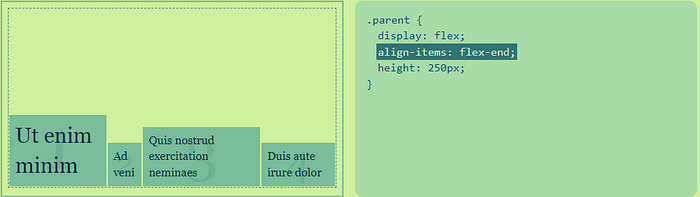
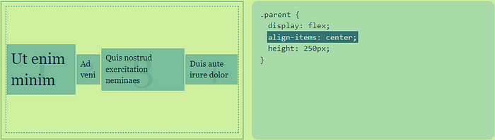
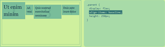
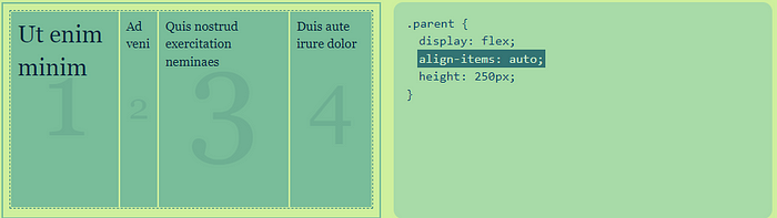
align-items -
Stretch -
flex-start -
flex-end -
center -
baseline -
auto -
so, This is all about CSS flexbox, Hope this helps.
and If it did then support me and do follow me on my social accounts 😄😄
👋👋 Happy Hacking and keep learning.👋👋
